Back to all projects
Good Squeeze
POSITIONING / PACKAGING / CAMPAIGN

Fruit first. Fuss last. A bright, straight-talking identity for a juice brand with nothing to hide.
THE CREATIVE DIRECTION
Nothing but the good stuff.
The question.
Give a juice concept a recognisable voice in a category crowded with wellness promises and interchangeable fruit photography.
Our response.
Build the identity around the cut fruit itself. Circular crops, punchy headlines and a warm pink field give the system a simple visual signature across packaging, launch posters and digital.
ONE IDEA. OUT IN THE WORLD.

01 / ON THE SHELF. Condensed lettering and generous colour make the bottle unmistakable.

02 / OUT IN THE CITY. A single fruit segment becomes a graphic signature at billboard scale.
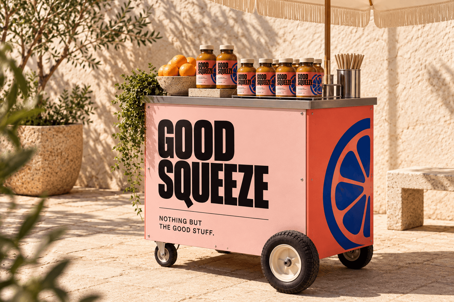
03 / IN PEOPLE’S HANDS. The same pink, coral and cobalt turn a small juice cart into a moving brand.
CLOSE UP / THE SAME GRAPHIC RULES, AT EVERY SCALE.
THE RESULT / A COMPLETE DIRECTION
The concept connects packaging, outdoor campaign and a physical activation. It demonstrates how one visual idea can scale from a bottle label to a street corner. These are proposed applications, not a live launch or measured business result.
Concept project for template demonstration. Replace with your own client work.